TLDR
For readable sticker typography, small logo artwork should be treated as a dedicated lockup—not a poster squeezed into a two-inch shape. Keep the project name dominant, remove fragile details, preserve open space inside letters, and test the design at its actual printed dimensions. Use visible borders, sticker halos, and production cutlines for their separate jobs. If a QR code competes with the name, put it on another sticker or a larger secondary design.
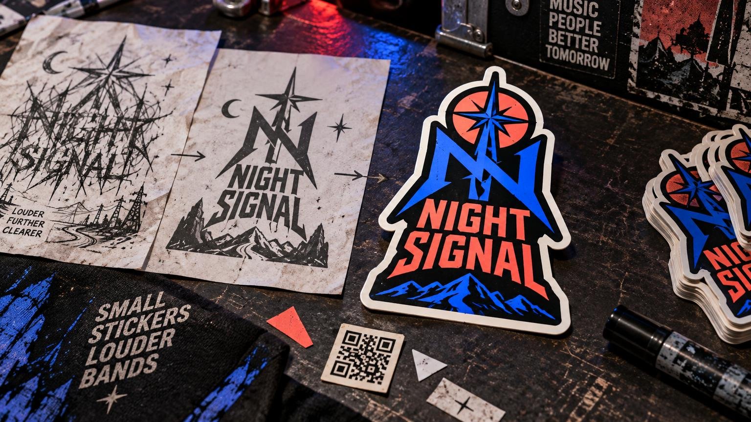
The central sticker typography small logo problem is reduction. A band logo can look vicious across a stage banner and turn into gray soup when printed small. Thin spikes close up, distressed textures fill counters, shadows merge with outlines, and supporting copy becomes decorative static. The fix is not necessarily a bland new logo. It is a compact version that preserves the identity’s strongest signals.
Build around recognition in this order: project name, overall silhouette, signature letterforms, then secondary details. If those first three survive, the sticker can still feel like your band, illustration practice, label, or art project without carrying every detail from the original asset.
Your sticker is not a miniature poster
Posters reward exploration. Small logo stickers reward instant recognition. A poster can support a project name, date, venue, social handle, release title, sponsor marks, ornamental frame, photograph, and QR code because viewers have space to move through the information. A small sticker rarely gives every element enough room to work.
Give the sticker one primary job. A logo sticker should make the name memorable. An event-information sticker can carry a date and destination. A QR sticker can prioritize scanning and a short call to action. Trying to combine all three usually weakens each one.
This does not mean every sticker must be minimal. Dense art can work when the density creates a strong shape rather than depending on tiny readable details. A black-metal logo, hand-drawn tag, or chaotic punk mark may remain recognizable through its silhouette even when individual scratches disappear. Preserve the characteristic rhythm; cut the visual crumbs.
Start with the final-size test
Zoom is a liar. Design software makes a tiny sticker fill an entire monitor, where hairline strokes appear substantial and miniature gaps look generous. Set the document to the intended physical dimensions, view it at approximately actual size, and print a paper test. Place that test on a laptop, case, notebook, mailer, or other realistic surface.
Then check it at three distances: close enough to inspect, arm’s length, and a few steps away. The name should remain identifiable at the distance that matters for its intended use. Supporting text may require closer reading, but it should not blur into a distracting band around the logo.
Adobe likewise recommends checking logos at small sizes, in black and white, and against light, dark, and busy backgrounds. Its guidance notes that decorative or script type can become difficult to read when reduced and that complex marks may not translate across small printed applications. Adobe’s logo-design guidance provides a useful broader set of scalability checks.
Build a dedicated small-sticker logo lockup
A lockup is an approved arrangement of the name, symbol, and any supporting elements. Instead of shrinking the master logo indiscriminately, make a small-size lockup with permission to simplify.
- Keep the full project name if recognition depends on it.
- Increase the spacing between letters that nearly collide after reduction.
- Open enclosed spaces in letters such as a, e, g, o, p, and R.
- Thicken essential strokes while preserving the character of the lettering.
- Remove dates, taglines, release titles, and social handles unless they serve the sticker’s only job.
- Retain one or two signature traits: a particular terminal, icon, slash, crown, eye, flame, or irregular baseline.
- Compare the simplified lockup beside the master artwork to confirm that they still belong to the same identity.
A useful test is to fill the entire design with solid black. Does the silhouette still have a memorable outline, or does it become an anonymous rectangle? Then reverse it to solid white on black. If recognition depends entirely on interior scratches or color effects, the small lockup needs stronger structural features.
Sticker typography for a small logo must survive reduction
Expressive type is welcome. Fragile type is the problem. Look beyond the font’s genre and inspect what happens to its narrowest strokes, interior openings, letter spacing, and distinctive characters at final size.
For ornate, spiky, distressed, or hand-drawn lettering, preserve the large gestures and reduce the smallest ones. A thorn that defines the top of the word may be worth keeping; twenty tiny scratches inside each letter probably are not. Controlled irregularity reads as style. Uncontrolled fill-in reads as a printing mistake.
Pay special attention to repeated vertical strokes. Names containing combinations such as ill, m, nn, or rn can collapse into picket fences. Slightly wider spacing, clearer joins, or a custom alternate letter may do more for readability than making the entire word larger.
Avoid choosing a universal minimum font size from a generic chart. Two typefaces set at the same nominal size can have radically different lowercase height, stroke weight, spacing, and counters. The correct threshold is the smallest version that remains readable in a physical final-size proof under realistic viewing conditions.
Use borders, halos, and cutlines for different jobs
These three elements are often discussed as if they were interchangeable, but they solve different problems. Printer terminology and file conventions vary, so confirm how the selected provider wants production paths supplied before final delivery.
| Element | What it does | What to inspect |
|---|---|---|
| Printed outline or keyline | Adds a visible stroke around letters or artwork to increase separation. | Make sure it does not fill counters, blunt sharp corners, or merge adjacent letters. |
| Sticker halo | Creates a visible area—often white or another solid color—between the artwork and outer sticker edge. | Check whether the halo strengthens the silhouette or makes the design feel inflated. |
| Production cutline | Tells the production workflow where the finished sticker should be cut. | Keep it smooth and confirm its setup with the printer; it is not automatically a printed border. |
A white halo can help a dark logo remain visible on black road cases, tinted bottles, or busy surfaces. A dark halo can hold pale artwork together. A contour-cut silhouette feels energetic but may become fussy when it follows every hair, thorn, drip, or brush fiber. Simplifying the outer path usually produces a cleaner object without forcing the printed art itself to become tame.
Vector artwork is particularly useful for logos, text, borders, shapes, and cutting workflows because paths can be resized without the same resolution dependence as raster pixels. Printing United Alliance material specifically identifies vector artwork with those kinds of elements and vinyl-cutting applications, though that does not mean every digitally printed sticker must use an identical file setup.
Use contrast and negative space before adding effects
When a logo feels weak at small size, the first instinct is often to pile on strokes, glows, shadows, and gradients. Start with simpler questions: Is the name clearly separated from its background? Are the letter interiors open? Is there enough empty space around the primary mark?
Negative space is the empty area around and between visual elements. It creates breathing room and balance, but on a sticker it also keeps neighboring forms from visually merging. Increase negative space selectively around the project name, inside enclosed letters, and between the logo and surrounding decoration.
Test the artwork in grayscale and as a one-color version. Two vivid colors can still have similar perceived brightness and blur together when viewed quickly. A strong one-color structure gives metallic, fluorescent, holographic, or other special treatments a better foundation rather than asking the finish to rescue weak hierarchy.
WCAG’s familiar 4.5:1 contrast ratio applies to normal digital text and explicitly excludes text that is part of a logo or brand name. It is therefore not a print-sticker specification or a pass-fail rule for band lettering. Use direct final-size print inspection instead: can someone find and distinguish the name under the lighting and viewing distance that matter?
Simplify detailed art without sanding off its personality
Simplification should be selective, not sterile. Begin by identifying the elements fans already associate with the project. It may be the arched word shape, a mascot’s eyes, a broken circle, a particular monogram, or the relationship between two colors. Protect those elements first.
- Duplicate the original artwork and label the copy as the small-size version.
- View it at the intended physical size rather than editing only while enlarged.
- Remove background texture and micro-details that do not affect recognition.
- Merge clusters of tiny shapes into one clearer mass.
- Strengthen the essential contour and open narrow gaps.
- Restore only the details that remain visible and meaningful at final size.
- Print again and compare the revision with the original from arm’s length.
This workflow can produce a family rather than one compromised asset: a full illustration for posters and shirts, a medium-detail merch mark, and a compact sticker or avatar lockup. Consistency comes from shared signature traits, not from forcing every application to contain identical detail.
Add QR codes without sacrificing the logo
A QR code is functional geometry, not background texture. DENSO WAVE states that a QR code requires a quiet zone four modules wide on every side. It also notes that encoding more data increases the number of modules and therefore the area required by the code. DENSO WAVE’s QR code area guidance explains this relationship.
That quiet zone must remain free of logos, borders, type, scratches, and decorative marks. DENSO WAVE also recommends making modules as large as practical and specifies at least four printer dots per module for stable operation. This is another reason not to assign one universal physical QR size: module count, print process, surface, contrast, viewing conditions, and scanning distance all affect the final test.
If the code forces the artist name to shrink, choose a different format. Put the QR code on a companion sticker, create a larger information sticker, or place it on the backing card while keeping the logo sticker clean. For codes intended for clubs and dim event spaces, use the more specific low-light QR sticker testing guide.
Scan the printed proof with multiple phones at several angles and distances. Test bright light, ordinary indoor light, and any venue-like lighting relevant to the campaign. Scan every production revision after changing the code’s color, surrounding art, size, destination, or material treatment.
Prepare the file and inspect the proof
Adobe identifies SVG, AI, and EPS as vector formats that can scale without quality loss. Vector paths are useful for adjustable logo shapes and clean typography, but they do not make an overcomplicated design readable. A mathematically perfect hairline can still be too delicate for the intended sticker.
Before converting type, save an editable master with live text. Then make a production copy and convert the text to outlines if requested by the printer or needed to preserve its appearance without transferring font dependencies. Adobe notes that outlined text retains its visual appearance but loses live-text editability.
When you send artwork to a custom sticker printer, include the intended finished dimensions and clearly identify any production cut path. Follow that provider’s current requirements for file type, color setup, bleed, and cutline naming rather than relying on a universal template.
Inspect the proof for more than spelling. Check the project name at final size, the narrowest gaps, enclosed letter spaces, outer silhouette, alignment between art and cut shape, and anything close to an edge. Also confirm which visible areas are printed artwork and which lines are production guides. These small production choices are part of what makes a high-quality custom sticker, not administrative trivia.
Small logo sticker checklist
- The project name is the first readable element.
- The logo works at its intended physical dimensions, not only while enlarged onscreen.
- Essential letter counters and gaps remain open.
- Decorative distress supports the identity instead of masking the name.
- The design has a recognizable silhouette in one color.
- Foreground and background separate clearly in grayscale.
- Negative space protects the primary mark.
- The printed outline, visible halo, and production cutline are not confused with one another.
- The outer cut shape avoids unnecessary microscopic turns and spikes.
- A QR code, if present, has an untouched quiet zone and passes physical scan tests.
- An editable master file is saved before text is outlined.
- The proof is reviewed at final size on a realistic surface.
Make recognition the final judge
The strongest small sticker is not automatically the design with the fewest elements. It is the design in which every surviving element contributes to recognition, character, or function. Keep the project name dominant, preserve the signature moves, and delete details that become noise after reduction.
Print the next draft at actual size before polishing it further. If the name reads, the silhouette hits, and the design still feels unmistakably yours, the lockup is doing its job. If not, enlarge the essential forms and give them more room before adding another effect. That discipline also makes the finished piece more useful in a broader guerrilla sticker marketing plan: people can only remember a name they can actually read.
References
- How to design a logo: Step-by-step guide | Adobe
- www.printing.org
- Understanding Success Criterion 1.4.3: Contrast (Minimum) | WAI | W3C
- Point for determining the code area | QRcode.com | DENSO WAVE
- Point for setting the module size | QRcode.com | DENSO WAVE
- Create outline text in Illustrator on the web (Beta) | Illustrator