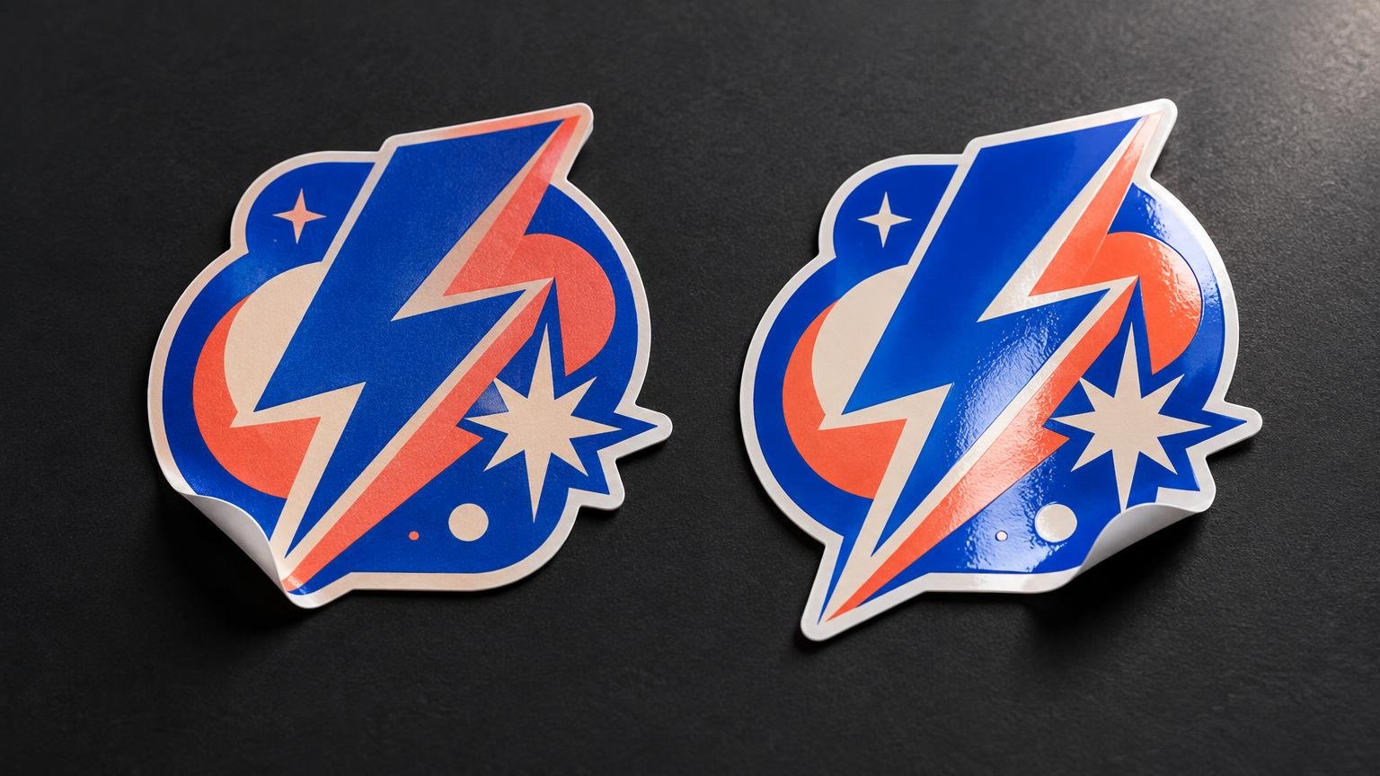
TLDR: In the matte vs glossy stickers decision, choose matte when you want low reflection, a subdued surface and artwork that remains comfortable to view under bright or unpredictable lighting. Choose gloss when shine, crisp contrast and saturated-looking graphics support the creative direction. Neither finish is automatically more waterproof, scratch-resistant or suitable outdoors; those qualities depend on the complete sticker construction.
The best finish is the one that behaves like part of the artwork. A gritty monochrome band logo may look right on matte. A fluorescent mascot built to detonate across a merch table may deserve gloss. Start with the desired visual character, consider where people will see the sticker, and then verify the material, adhesive and protective layer separately.
| Decision factor | Matte | Glossy | What to verify separately |
|---|---|---|---|
| Surface appearance | Smooth, subdued and non-glossy | Shiny and visually assertive | Face material and laminate construction |
| Reflection | Usually reduces distracting glare | Produces more visible reflections and highlights | Actual lighting and viewing angle |
| Creative fit | Muted palettes, text-heavy art, understated packaging | Bold logos, colorful illustrations, energetic giveaways | A printed sample using the real artwork |
| Photography | Can be easier to position when reflections are unwanted | Can create intentional shine and bright highlights | Lighting setup, angle and creative intent |
| Durability | Not determined by appearance alone | Not determined by appearance alone | Adhesive, ink, laminate, surface and exposure |
| QR codes | Often a practical starting point in glare-prone settings | Can work when reflection is controlled | A scan test in the intended location |
What matte vs glossy stickers actually change
Matte and gloss primarily describe surface appearance. Avery characterizes matte sticker material as smooth and non-glossy, while describing glossy material as photo-quality and intended to make graphics pop and text look sharper. Those descriptions are useful visual cues, not universal promises about every printer’s material system.
Gloss creates brighter reflected highlights. That can make colorful illustrations, photographic artwork and clean vector logos feel more immediate. It can also produce distracting reflections when a sticker sits beneath venue lights, near a window or at an angle to a camera.
Matte spreads reflection into a softer-looking surface. It tends to suit restrained palettes, dense typography and designs meant to feel tactile or understated. It does not automatically drain the life from good artwork, but it can make the same colors feel less luminous than they do beneath a glossy surface.
Screen previews cannot settle this choice. Monitors produce light; printed stickers reflect it. Review the digital proof for spelling, cutlines and layout, then judge finish with a physical sample whenever the look is central to the release. Guerilla Stickers describes a workflow in which customers choose specifications, upload artwork, review a proof and approve it before printing and cutting.
Choose matte when low glare and restraint matter
Matte is the stronger default when the sticker should sit naturally on packaging, gear or merch rather than throw a bright highlight back at the viewer. It is especially worth considering for black-and-white artwork, muted color palettes, fine illustration and typography-heavy designs.
That makes matte a natural candidate for several creative situations:
- Band logos with distressed textures or a photocopied-zine aesthetic
- Illustrator signatures, captions and other text that must remain comfortable to read
- Premium-feeling packaging that already uses uncoated paper or subdued colors
- Merch photographed beneath lights that would create unwanted reflections
- QR stickers installed in glare-prone locations, provided the finished code passes a real scan test
Matte is not automatically better for every photograph. Glossy highlights can be an intentional part of a product shot, while a matte surface can fit editorial or handmade visual directions. Decide whether reflection is an obstacle or an ingredient.
Do not assume a matte sticker is writable, either. Writing performance depends on the exact surface and the pen or marker. If customers need to add names, dates or edition numbers, ask the printer about compatibility and test the intended writing tool on a finished sample.
Choose gloss when shine is part of the design
Gloss works when the sticker should look loud before anyone reads it. Bold logos, high-contrast cartoons, colorful giveaway packs and polished product graphics can all benefit from a reflective surface. On a crowded merch table, that flash of light may support the design rather than fight it.
Good candidates for gloss include:
- Bright mascot illustrations and pop-art graphics
- Photo-based designs intended to have a polished appearance
- Clean logos with large areas of saturated color
- Event handouts designed for immediate visual impact
- Sticker packs in which a shiny finish helps unify several different designs
Gloss still needs context. A dark glossy sticker under a hard spotlight may mirror the light source, and small text can become harder to see from particular angles. If readability is essential, strengthen contrast and simplify undersized details before treating finish as the solution. The same discipline applies to band and artist typography at small sticker sizes.
Durability depends on the complete sticker construction
The biggest mistake in this comparison is treating finish as shorthand for toughness. A sticker is a system: face material, ink or print process, adhesive, protective laminate or coating, cut and application surface all affect how it behaves. Exposure to moisture, sunlight, cleaning, abrasion and temperature adds another set of variables.
Protective overlaminates are not restricted to one visual style. 3M’s official polyester overlaminating film information includes matte and high-gloss appearances for label and nameplate graphics. General Formulations likewise publishes abrasion- and moisture-protection claims for a particular matte laminate, illustrating why such claims should be attached to a defined product rather than generalized to every matte sticker.
If durability matters, ask direct construction questions:
- What is the printable face material: paper, vinyl or another film?
- Is the image protected by a laminate or coating, and which product is it?
- What exposure does the manufacturer rate or recommend it for?
- Is the adhesive intended for the application surface?
- Does the sticker need to survive moisture, repeated handling, abrasion or outdoor exposure?
- Are removability and clean removal more important than maximum holding power?
Finish should come after those requirements, not replace them. For a deeper breakdown, compare paper and vinyl stickers for packaging and merch and review the factors that define a high-quality custom sticker.
Match the finish to the actual use case
Merch tables and sticker packs
For merch sold under changing event lights, test how the artwork looks both flat on the table and held upright. Matte can preserve visibility when overhead lights are brutal. Gloss can give colorful art more shelf appeal. A mixed pack can use both finishes intentionally, but random inconsistency can make the set look like leftover inventory.
Packaging and order inserts
Match the sticker to the package rather than evaluating it alone. Matte often blends with kraft boxes, uncoated cards and restrained branding. Gloss creates contrast against those same surfaces and can make a seal or logo feel more deliberate. If the sticker closes tissue or a box, adhesive and surface compatibility matter as much as appearance.
Laptops, bottles and everyday gear
These applications involve handling, curved surfaces and possible moisture. Choosing gloss does not prove that the sticker is waterproof, and choosing matte does not prove that it will resist scratches. Ask for the construction and intended application. If the sticker must bend around a bottle or case, test adhesion near edges and curves before scaling the order.
QR code stickers
A matte finish is often a sensible starting point where glossy reflections could obscure part of a code, but finish is only one variable. Scan reliability also depends on contrast, the clear quiet zone around the code, data density, print quality, curvature, lighting and phone-camera conditions. Guerilla Stickers recommends testing the printed sticker under conditions that resemble the intended venue.
Use the actual size, surface and location. Scan from realistic distances and angles with several phones. Test beneath the brightest and dimmest expected lighting, not just at a desk. The complete low-light QR sticker testing process is more useful than assuming matte will rescue a crowded or undersized code.
Run a small test before committing to a large batch
A proof confirms the production interpretation of the file, but it cannot fully reproduce reflected light, texture or handling. When finish materially affects a merch drop or campaign, order or request a representative sample before scaling.
- Inspect the art at arm’s length and from across a merch table.
- Move it beneath daylight, warm indoor light and the harshest likely venue lighting.
- Photograph it from several angles if it will appear in social posts or product listings.
- Apply it to the real package, case or display surface.
- Handle the sample and check edges, fine text and dark areas.
- For QR artwork, scan repeatedly under realistic conditions.
If both finishes remain plausible, print the same design in matte and gloss. Keep size, material and artwork consistent so the surface finish is the meaningful variable. That simple side-by-side comparison beats arguing from a monitor.
Distribute promotional stickers without creating cleanup problems
Finish selection does not change the basic rule of street-team promotion: place stickers only where you have permission. Handouts, order inserts, approved venue displays and designated community boards let the artwork travel without turning a campaign into somebody else’s scraping job. Guerilla Stickers’ promotional guidance supports testing before scaling and using permission-based distribution.
The practical verdict
Choose matte for controlled reflection, comfortable readability and an understated visual character. Choose gloss when shine, bright highlights and visual punch are part of the concept. For water, abrasion, outdoor exposure or demanding surfaces, ignore finish stereotypes and evaluate the complete material-and-laminate system.
Before approving a run, view the artwork in representative lighting and test it in its intended application. Once the finish and construction requirements are clear, you can move into custom sticker printing with a useful specification instead of a vague request for whatever looks “best.”
References
- Stickers: Difference Between a Matte and Glossy Sticker | Avery
- Custom Stickers With a Guerilla Streak – Guerilla Stickers
- Polyester Overlaminating Films
- GF 162 | General Formulations
- How to Make a QR Sticker Easy to Scan in Low-Light Venues – Guerilla Stickers
- How to Use Promotional Stickers for Local Business Marketing Without Wasting Them – Guerilla Stickers